Stop letting “minimalist influencers” convince you that a wardrobe of expensive beige linen is the only way to look put-together. Most of that advice is just a way to sell you a specific, overpriced aesthetic that ends up looking like a pile of unwashed laundry. I spent two years pinning hems in a basement studio, and if there is one thing I learned, it’s that understanding how neutrals actually function has nothing to do with buying more sand-colored trousers. It’s about undertones, fabric weight, and why that “oatmeal” sweater makes you look like you’ve caught a fever instead of looking chic.
I’m not here to sell you a capsule wardrobe starter kit or tell you to purge your closet. I’m going to show you the actual maths of color. We’re going to talk about why a charcoal grey works better for your Tuesday meeting than a muddy tan, and how to spot a cheap, poorly dyed neutral that will pill after three washes. I’ll give you the real, no-nonsense guide to making the colors you already own work for your life, not for a curated Instagram feed.
Understanding How Neutrals Actually Function
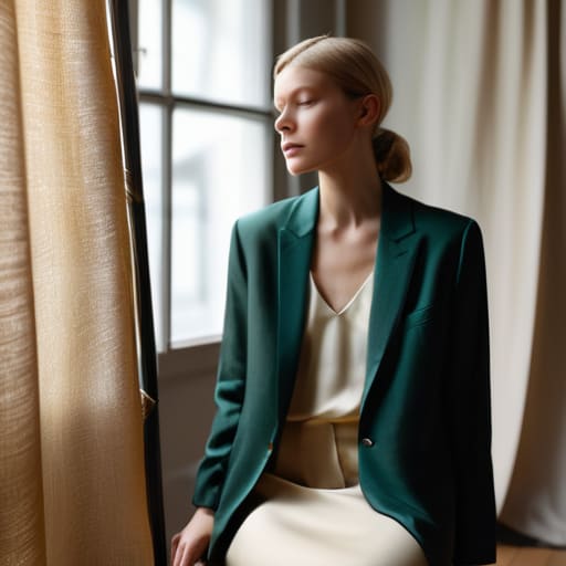
The mistake most people make is treating neutrals like a lack of color, rather than a specific tool. If you think “neutral” just means beige, black, or white, you’re missing the entire point of using neutrals as a foundation. In reality, neutrals are the scaffolding of your wardrobe. They are the quiet, reliable pieces that allow your more interesting items—that vintage silk blouse or the heavy wool blazer—to actually stand out instead of fighting for attention.
To make this work without looking like you’re wearing a uniform of boredom, you have to master color temperature in neutral tones. A “warm” beige has a yellow undertone that might look beautiful in a heavy linen, but if you pair it with a “cool” grey that has blue undertones, the whole outfit looks disjointed and cheap. It’s not that the clothes are bad; it’s that the temperatures are clashing. Instead of hunting for more colors, start looking at the undertones of what you already own. Once you align the temperatures, you stop needing more clothes and start actually wearing the ones you have.
Key Things to Know
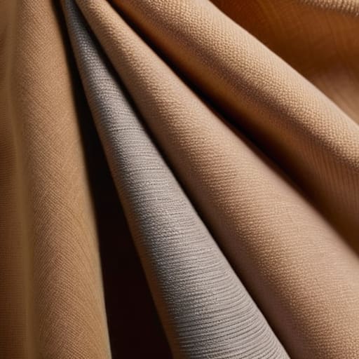
First, let’s get one thing straight: “neutral” doesn’t mean “boring,” and it certainly doesn’t mean “beige.” If you’re staring at a sea of oatmeal and sand and feeling like a ghost, you’re likely ignoring color temperature in neutral tones. A cool, stony grey is a completely different beast than a warm, buttery cream. If you try to force a warm camel coat over a cool-toned navy base, you aren’t “playing with contrast”—you’re just looking mismatched. You need to know if your skin leans warm or cool before you commit to a palette, otherwise, you’re just buying expensive fabric that makes you look tired.
Second, stop trying to build a “capsule wardrobe” by buying ten identical white t-shirts. That is a recipe for a wardrobe that feels flat and lifeless. The secret to mixing textures in neutral outfits is what actually creates depth. A heavy wool trouser paired with a silk camisole or a chunky knit against smooth denim is how you make a single color look expensive. It’s about the way the light hits the weave, not how many different shades of tan you can cram into your drawer.
Practical Tips and Steps
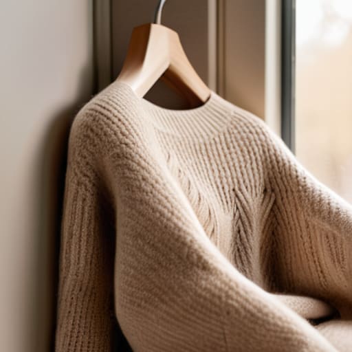
First, stop looking at your closet as a collection of individual items and start seeing it as a system. When you’re using neutrals as a foundation, the goal isn’t to match everything perfectly—that looks like a hotel lobby. Instead, you need to master color temperature in neutral tones. If you have a warm, oatmeal-colored wool sweater, don’t try to force it to play nice with a cool, blue-toned grey trouser. It’ll look muddy. Pick a temperature and stick to it for the base of your outfit, then let the textures do the heavy lifting so you don’t look like a beige blob.
Second, if you’re serious about building a capsule wardrobe with neutrals, look at the fabric weight before you look at the brand. A thin, polyester “cream” shirt will look cheap and limp after three washes, whereas a heavy cotton or a structured linen in the same shade will actually hold its shape. I always tell my clients: if the fabric is flimsy, the color won’t matter because the silhouette will fail you. Spend your money on the weight of the cloth, not just the shade.
Common Mistakes to Avoid
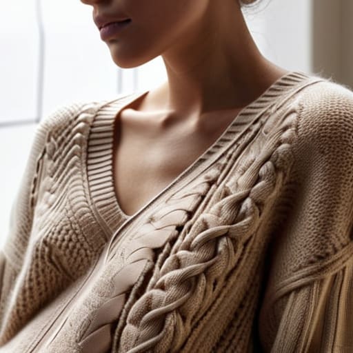
The biggest mistake I see—and it drives me mental—is people thinking a “neutral palette” means wearing the same flat, lifeless beige from head to toe. If you buy a beige sweater and beige trousers in the exact same weave, you won’t look “minimalist”; you’ll look like you’re wearing a shapeless sack. You have to master mixing textures in neutral outfits to create depth. Think a heavy wool trouser paired with a silk camisole, or a chunky knit over a crisp cotton shirt. Without that tactile contrast, your outfit has no architecture, and no amount of styling can fix a lack of dimension.
Another trap is ignoring color temperature in neutral tones. You can’t just grab every “off-white” on the rack and hope for the best. If you pair a warm, buttery cream with a cool, blue-based grey, one of them is going to look dirty, and it isn’t the fabric—it’s the mismatch. Before you commit to building a capsule wardrobe with neutrals, check your metals and your undertones. If the colors are fighting each other, you’ll end up feeling washed out, and you’ll mistakenly blame your face instead of your poorly matched palette.
Final Thoughts
Look, at the end of the day, stop treating your neutral pieces like a boring safety net and start treating them like the structural engineering of your closet. If you focus too much on the “rules” of a neutral color palette theory, you’ll end up looking like a beige-on-beige ghost. The secret isn’t about matching every shade of oatmeal perfectly; it’s about using neutrals as a foundation so that your actual personality—and the clothes that actually fit your body—can do the heavy lifting.
If you’re serious about building a capsule wardrobe with neutrals, remember that a single fabric type is your enemy. A flat, cotton beige shirt next to a flat, cotton beige trouser looks like a uniform, not a choice. You have to start mixing textures in neutral outfits—think a heavy wool blazer over a silk slip or a chunky knit paired with structured denim. That contrast is what keeps you from looking like you’ve given up. Stop shopping for “colors” and start shopping for depth and durability. If the fabric holds its shape and the seam allowance is generous enough for a tailor to work with, you’ve actually made a smart purchase.
5 ways to stop your neutrals from looking like a beige crime scene
- Check the fabric weight before you commit. A thin, polyester-blend cream blouse is going to look limp and cheap by Tuesday, whereas a heavy-weight cotton or a structured linen in the same shade will actually hold its shape and look intentional. If the fabric has no “soul,” the neutral color won’t save it.
- Stop ignoring undertones. You don’t need “more beige”; you need the right beige. If you have cool undertones, a yellowish camel is going to make you look tired, not chic. Match the temperature of the neutral to your skin, or you’ll spend the whole day feeling like you’re wearing a costume.
- Use texture to create the “expensive” look. When you’re wearing a monochromatic neutral outfit, it can easily turn into a shapeless blob. Mix a chunky knit wool sweater with a smooth silk skirt; the contrast in how light hits those surfaces is what makes a neutral palette look curated rather than accidental.
- Mind the seam allowance and structure. A neutral blazer is only a “staple” if the shoulders actually sit where your shoulders are. If you buy a cheap neutral piece with poor construction, the lack of color means there’s nothing to distract the eye from the fact that the garment is sagging.
- Do the math on the “cost per wear” vs. the “cost to fix.” If you find a beautiful charcoal wool coat at a charity shop for £20 but the sleeves are two inches too long, factor in the £15 alteration. If the total is £35 for a coat that will last five years, that’s a win. If it’s a synthetic blend that won’t breathe, walk away.
The Math of the Neutral Wardrobe
Neutrals aren’t a color palette; they’re a structural foundation. If you buy a beige sweater that’s made of cheap, thin acrylic, it’s just a pile of lint waiting to happen. But if you find a heavy-weight wool in a stone grey, you aren’t just buying a color—you’re buying a piece that actually holds its shape, survives the wash, and makes every other thing in your closet look intentional rather than accidental.
Neve Okonkwo-Barr
The Bottom Line
Look, we’ve covered a lot, but if you walk away with nothing else, remember this: neutrals aren’t a safety net for when you’re too tired to dress; they are the structural foundation of a working wardrobe. Stop treating beige, navy, and charcoal like they are interchangeable, boring filler. Pay attention to the fabric weight, check the seam construction, and for the love of everything, make sure the undertone doesn’t make you look like you’ve been awake for forty-eight hours straight. If you can master the balance between texture and tone, you won’t need to keep buying “statement pieces” every time you feel a bit uninspired. A well-curated palette of neutrals, properly fitted and high-quality, will outlast a hundred micro-trends and a thousand cheap fast-fashion hauls.
At the end of the day, style isn’t about how much you can spend to hide a silhouette you don’t like; it’s about how much you can leverage what you already own. You don’t need a closet full of colors to be interesting, and you certainly don’t need to buy your way out of a style rut. Use these neutrals to build a base that actually works on a rainy Wednesday, and then let your personality do the heavy lifting. When the clothes fit right and the colors don’t fight you, you stop worrying about your outfit and start actually living your life. That is the only real investment worth making.
Frequently Asked Questions
If I’m buying a neutral piece second-hand, how can I tell if the fabric is actually high-quality or just a cheap synthetic that’s going to pill after three washes?
Don’t just look at the brand; look at the composition tag. If it’s a “blend” that’s mostly polyester or acrylic, run. Those pills are practically baked in. Instead, do the scrunch test: grab a handful of the fabric, squeeze hard for five seconds, and let go. If it bounces back without looking like a crumpled receipt, the fiber density is decent. Also, check the weight—cheap synthetics feel thin and “squeaky,” while real wool or heavy cotton has a satisfying gravity.
Is it actually worth paying a tailor to adjust the fit of a beige or cream item, or should I just save that money for something that already fits perfectly?
If the item is a high-quality natural fiber—think heavy linen or a thick wool blend—pay the tailor. A cream wool blazer with the wrong sleeve length looks like a mistake; a tailored one looks like an heirloom. But if it’s that thin, shapeless polyester blend from a high-street sale? Don’t bother. You’ll spend £20 trying to fix a £15 garment that’s never going to hold its structure anyway. Save your money for the good stuff.
How do I stop looking like a walking beige wall when I'm trying to build a capsule wardrobe—do I need to mix textures or is that just marketing nonsense?
It is absolutely not marketing nonsense; it’s physics. If you wear a flat cotton beige shirt with flat cotton beige chinos, you’re just a silhouette of nothing. You need contrast to create depth. Pair that heavy wool sweater with a silk slip skirt, or a rugged denim against a soft knit. Texture creates shadows, and shadows are what stop you from looking like a wall. If the fabrics feel different to your touch, they’ll look different to the eye.
