Stop letting fashion influencers convince you that wearing color requires a total identity transplant or a massive budget for “statement pieces” that look ridiculous after one wash. Most of the advice out there makes it sound like you need to commit to a neon jumpsuit just to escape your navy-blue comfort zone, which is absolute nonsense. If you’ve been staring at a sea of beige and charcoal because you’re terrified of looking like a walking highlighter, I get it. But learning how to wear colour if you never do isn’t about buying more clothes; it’s about understanding how a single saturated thread interacts with the neutrals you already own and, more importantly, how the fabric weight affects how that color actually sits on your frame.
I’m not here to sell you a “capsule collection” of brights that will end up in a donation bin by next season. Instead, I’m going to show you the practical math of color: how to use small, high-quality hits of pigment, why a structured emerald wool beats a flimsy polyester pink every single time, and how to spot a shade that actually complements your skin tone without needing a stylist’s eye. We’re going to build a strategy that works for a regular Wednesday, not just a photoshoot.
Understanding How to Wear Colour if You Never Do

The biggest mistake people make when they decide to stop living in a beige bubble is thinking they need to go full neon overnight. You don’t. If you’ve spent years playing it safe in navy and charcoal, jumping straight into a primary red jumpsuit is going to feel like wearing a costume, and you’ll end up shoving it back in the closet by Tuesday. Instead, think about transitioning from neutrals to color through small, manageable increments. I always tell my clients to look at their existing “safe” pieces—that black blazer or those grey trousers you actually like—and treat them as a canvas rather than a barrier.
You don’t need a degree in color theory for beginners to get this right; you just need to understand how a single piece interacts with what you already own. Start by experimenting with a neutral base with colorful accents. Pick one item—maybe a sage green knit or a cobalt blue scarf—that feels “safe-adjacent” and pair it with your standard uniform. It’s much easier to manage the psychological shift of wearing color when the silhouette and the fabric weight remain familiar.
Key Things to Know
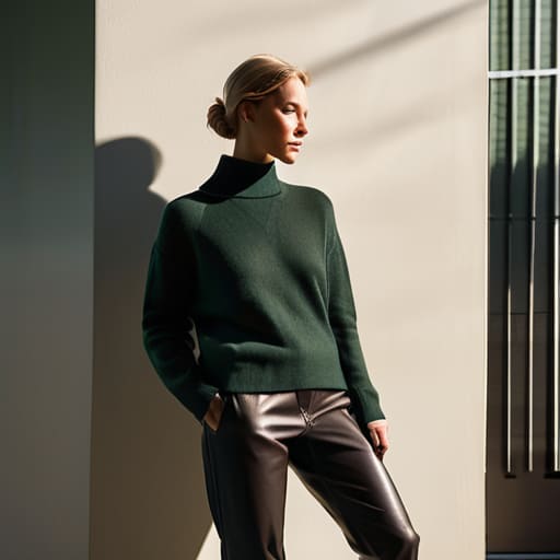
First, stop treating color like a high-stakes gamble. You don’t need to walk out of the house looking like a highlighter just to prove you’ve changed. The easiest way to start transitioning from neutrals to color is to stop looking at entire outfits and start looking at single items. If you own a reliable navy blazer or a charcoal trouser, those are your anchors. Instead of a full monochromatic bright look, try a neutral base with colorful accents—think a forest green sweater paired with your existing black jeans. It’s low risk, and it doesn’t feel like you’re wearing a costume.
Second, pay attention to the fabric, not just the shade. A bright red in a cheap, thin polyester will look shiny and “costume-y” almost immediately because the light hits the synthetic fibers weirdly. But a bright red in a heavy cotton drill or a structured wool? That looks intentional and expensive. If you are building a colorful capsule wardrobe, prioritize the weight of the textile. A color only looks as good as the drape of the garment, and a good drape is something no amount of “color theory for beginners” can fix if the fabric is rubbish.
Practical Tips and Steps
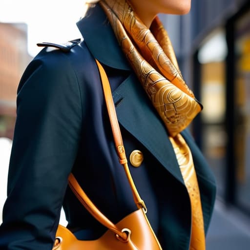
Start with the “low-stakes” approach. If the idea of a bright cobalt blazer makes you want to hide in a changing room, don’t do it. Instead, focus on transitioning from neutrals to color through accessories or small hits of pigment. I’m talking about a structured bag in a deep forest green or a silk scarf that adds a pop of ochre to your usual navy trench. These are easy wins because they don’t require you to re-learn your entire silhouette, and if you hate them by Tuesday, you haven’t wasted a hundred pounds on a garment that’s going to sit dead in your wardrobe.
If you’re feeling braver, look at your existing rotation. Most of you have a solid foundation of black, navy, or grey, which is actually perfect for building a colorful capsule wardrobe. Use those pieces as a canvas. A bright coral knit looks intentional and expensive when paired with charcoal trousers, rather than looking like you’re wearing a costume. Just check the fabric weight first; a cheap, thin synthetic in a neon shade will look plastic, but a high-quality cotton or wool in a rich jewel tone will actually hold its shape and look like the investment it is.
Common Mistakes to Avoid
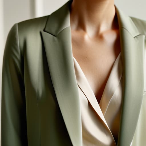
The biggest mistake I see is people treating color like a dare. They wait until they feel “brave” and then buy a neon polyester top that looks like a mistake the second they put it on. If you’re transitioning from neutrals to color, don’t jump straight into high-saturation primaries. You’ll end up feeling like you’re wearing a costume rather than an outfit. Most people overcompensate by buying “loud” pieces that lack structure, forgetting that a bright color in a cheap, flimsy fabric just looks messy.
Another trap is ignoring how the garment actually sits on your frame. You can find the perfect shade, but if the seam allowance is non-existent or the drape is off, that bright hue is just going to highlight every construction flaw. Stop trying to master complex color theory for beginners before you’ve mastered the basics of fit. You don’t need a rainbow; you just need to stop buying pieces that fight your silhouette. A single, well-fitted sweater in a rich jewel tone is infinitely better than five bright items that make you want to hide in a corner.
Final Thoughts
Look, I’m not asking you to go out and buy a neon jumpsuit just because a trend report told you to. That’s how you end up with a garment that sits in the back of your closet gathering dust because it feels like a costume. Real style isn’t about a sudden, jarring transformation; it’s about the slow process of transitioning from neutrals to color in a way that actually feels like you. Start with something small—a scarf, a belt, or even just a pair of socks—and see how it interacts with the clothes you already know fit your body well.
If you’re feeling overwhelmed, remember that you don’t need to master complex color theory for beginners overnight. My best advice is to focus on a neutral base with colorful accents. If your trousers and jacket fit perfectly and stay in that reliable navy or charcoal zone, a single bright piece won’t feel like it’s wearing you. At the end of the day, the goal isn’t to look like a walking rainbow; it’s to look like someone who isn’t afraid to take up a little bit of space.
Five Ways to Stop Being Afraid of the Rainbow
- Start with the “Third Piece” rule. If you’re terrified of a bright jumpsuit, don’t buy one. Keep your reliable black trousers and white tee, but add a cobalt blue cardigan or a forest green blazer. It’s a low-stakes way to see how much color your skin actually likes before you commit to a full-body takeover.
- Check the fabric weight before you commit to a loud shade. A bright neon in a cheap, thin polyester is going to look like a costume and probably feel like plastic. A bright shade in a heavy cotton drill or a sturdy linen? That looks intentional, expensive, and much more “Wednesday-ready.”
- Use your neutrals as a buffer, not a shield. You don’t have to wear color head-to-toe. If you’re wearing a bright terracotta top, pair it with navy or charcoal instead of just black. It softens the blow and makes the outfit look like a curated choice rather than a sudden accident.
- Look at your existing hardware. If you have a lot of gold jewelry or warm-toned accessories, lean into the “warm” side of the color wheel—mustards, olives, and rusts. It’s much easier to integrate color when it actually talks to the things you already own.
- Don’t ignore the “cost of regret.” If you buy a bright pink shirt just because it’s on sale, but you know you’ll only wear it once because it makes you feel exposed, that’s a bad math equation. Only buy the color if the fit is so perfect that you feel secure enough to actually stand in it.
The Myth of the 'Safe' Neutral
Stop treating color like a personality test you’re going to fail; you don’t need to commit to a neon jumpsuit to stop being invisible. If you’ve spent years hiding in charcoal and navy, start with a single piece in a fabric that actually holds pigment—like a heavy cotton or a good wool—and make sure the fit is impeccable. A bright color in a garment that pulls at the seams looks like a costume, but a bright color in a perfectly tailored silhouette looks like a choice.
Neve Okonkwo-Barr
The Bottom Line
Look, we’ve covered a lot of ground, but if you remember nothing else, remember this: wearing color isn’t about a sudden, terrifying overhaul of your entire closet. It’s about understanding that a bright shade works best when the fabric weight is right and the fit doesn’t make you feel like you’re wearing a costume. You don’t need to drop three months’ rent on a designer silk shirt in cobalt just to test the waters; you can start with a single accessory or a piece that has enough seam allowance to actually move with your body. Whether you’re opting for a muted sage or a punchy terracotta, the goal is to find the balance between a shade that pops and a silhouette that feels like home.
At the end of the day, the fashion industry wants you to feel like color is a high-stakes performance, but it’s really just a tool. Stop treating your wardrobe like a museum of “safe” neutrals and start treating it like a toolkit for your actual life. You don’t need permission to be seen, and you certainly don’t need a brand-new wardrobe to do it. Pick one piece, get it tailored so it actually sits right on your shoulders, and wear it on a random Wednesday. Style isn’t about perfection or following a trend cycle; it’s about the confidence that comes from knowing exactly how your clothes fit and how they make you feel.
Frequently Asked Questions
I found a vintage bright green blazer at a charity shop, but the fabric feels thin and scratchy; is it worth getting it tailored or should I leave it?
If it’s scratchy, leave it. I can fix a sleeve length or a waistline for twenty quid, but I can’t fix a sensory nightmare. If the fabric is thin, it’ll lose its shape after three wears, and no amount of tailoring can give structure back to a flimsy weave. Don’t let the “find” high trick you; if the material feels cheap and irritating now, it’ll just be an expensive regret in your closet.
How do I know if a bright colour is going to wash me out before I commit to the full price of the garment?
Don’t just stand there in the middle of the shop staring at yourself. Grab a piece of fabric from a nearby rack—anything in that same shade—and hold it directly under your chin in the mirror. If your skin suddenly looks grey, tired, or like you’ve had three hours of sleep, put it back. You want the colour to make your eyes pop, not make you look like you’re fading into the background.
If I'm only brave enough to try one thing, should I go for a colourful accessory or a full piece of clothing?
Go for the accessory. A full garment is a massive commitment—if the fabric is cheap or the fit is slightly off, a bright color will just act like a neon sign pointing out the flaws. A high-quality scarf, a sturdy leather belt, or even a structured bag in a bold hue is much safer. It adds the impact without the risk of looking like you’re wearing a costume. It’s low stakes and high reward.
