Stop letting “color theory” influencers make you feel like you need a PhD just to get dressed on a Tuesday. They’ll tell you that you need a complete seasonal palette overhaul or a hundred new shades to look “put together,” but that is just expensive marketing designed to keep you clicking ‘add to cart.’ Most of the time, the struggle with how to choose colours that work together isn’t about finding the perfect rainbow; it’s about realizing that your favorite navy trousers and that mustard sweater you found in a charity shop actually can live in the same wardrobe if you understand the undertones.
I’m not here to sell you a new capsule collection or a subscription to a styling app. I’m going to show you the actual math of color—the kind that matters when you’re trying to match a thrifted blazer with the basics you already own. We’re going to talk about fabric saturation, why certain tones make cheap polyester look even cheaper, and how to build a cohesive rotation without spending a penny on “trend” shades that will be exhausting to wear by next month.
Stop Guessing How to Choose Colours That Work Together
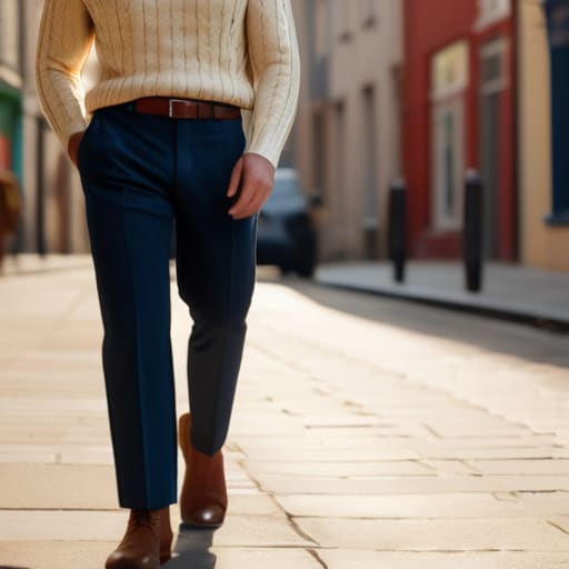
Look, you don’t need a degree in fine arts to stop looking like a walking highlighter. Most people get stuck trying to master complex color wheel theory explained in textbooks, but in the real world—the one where you’re running for a bus or sitting in a fluorescent-lit office—it’s much simpler. The biggest mistake I see is people chasing “matching” sets that feel stiff and unnatural. Instead, start thinking about visual balance in design. If you’re wearing a heavy, dark navy trouser, don’t feel obligated to find the exact same navy top. That’s not style; that’s a uniform.
Instead, try creating a cohesive color palette by grouping tones that share a similar “temperature.” If you’re leaning into warm vs cool color tones, stick to one side of the fence for your base layers. If you want a bit of drama without the headache, complementary color schemes are your best friend—think a forest green skirt paired with a muted terracotta top. It’s high contrast, but because the saturation levels are similar, it looks intentional rather than accidental. Just remember: if the colors fight each other for attention, you’ll end up feeling self-conscious all day.
Color Wheel Theory Explained Without the Academic Fluff
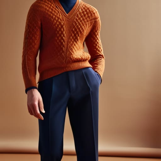
Look, you don’t need a degree in fine arts to understand color wheel theory explained in a way that actually helps you get dressed. Forget the complex diagrams in textbooks; for us, it’s just about knowing which neighbors get along. If you want high drama, go for complementary color schemes—that’s picking colors from opposite sides of the wheel, like a navy trouser paired with a burnt orange knit. It’s bold, it’s intentional, and it looks like you actually tried.
If you’re someone who hates the mental load of getting dressed at 7:00 AM, stop fighting the wheel and start using monochromatic color schemes. This isn’t just wearing one single shade of grey like a Victorian ghost; it’s layering different depths of the same family. Think a chocolate brown wool skirt with a camel cashmere sweater. It creates instant visual balance without you having to perform a mathematical equation in front of your mirror. It’s the easiest way to look expensive when you’re actually just playing with texture and tone.
Mastering Complementary Color Schemes for a High Impact Wardrobe
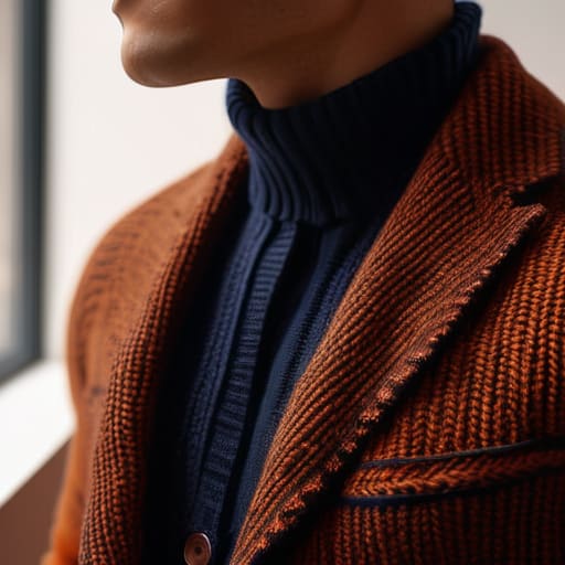
If you want to stop looking like you got dressed in the dark and start looking intentional, you need to understand complementary color schemes. This isn’t about wearing a clown suit; it’s about using the high contrast found on the color wheel to make a single piece pop. Think of it this way: if you have a navy blazer that’s seen better days, pairing it with a burnt orange knit creates an instant visual tension that looks expensive, even if the knit was five pounds from a charity shop. The trick is to let one color dominate. If you go 50/50 with two high-contrast colors, you lose that visual balance in design and end up looking like a sports team.
For the rest of us who don’t want to look like we’re auditioning for a music video, I usually suggest leaning into the neutrals. Use those bold, complementary pairings in your accessories—a scarf, a bag, or even a belt—rather than your entire outfit. This keeps the look grounded and ensures you aren’t fighting your own reflection every time you walk past a window.
Warm vs Cool Color Tones Finding Your Actual Match

Look, you can master every complementary color scheme in the book, but if you’re wearing a shade that fights your skin, you’re just going to look tired. I see this constantly in the studio: someone buys a stunning, expensive emerald silk blouse, but the undertone is so icy it makes them look washed out. This isn’t a “bad color” problem; it’s a temperature mismatch. To get it right, you need to stop looking at the garment in isolation and start looking at how it reacts to your skin.
The easiest way to figure out your warm vs cool color tones is the silver vs gold test. Grab a piece of bright gold jewelry and a piece of silver. Hold them up to your face in natural light. If the gold makes your skin look even and glowing, you’re warm; if the silver makes you look less sallow, you’re cool. Once you know this, creating a cohesive color palette becomes much easier because you stop fighting your own biology. If you’re warm, lean into terracottas and olives; if you’re cool, stick to the navy and crisp berries. It saves you a massive amount of money on “mistake” pieces that end up in the donation bin.
Creating a Cohesive Color Palette That Survives the Week
Here is the reality: a palette isn’t just a mood board of pretty shades; it’s a mathematical equation for your Monday-to-Friday life. If you pick five colors that all demand to be the center of attention, you’re going to spend every morning fighting your closet. To actually succeed at creating a cohesive color palette, you need a hierarchy. I always tell my clients to pick two “workhorse” neutrals—think navy, charcoal, or a heavy cream—and then choose two or three accent colors that actually play nice with them.
If you’re feeling overwhelmed, stop trying to reinvent the wheel and start using monochromatic color schemes. It is the ultimate cheat code for looking expensive without actually being one. Pick one base color, like an olive green, and then grab different weights and textures of that same hue—a silk blouse, a chunky wool knit, a cotton chino. Because you’re staying within one family, the visual balance is built-in. You aren’t guessing if things match; you’re just getting dressed.
Five ways to stop your closet from looking like a chaotic accident
- Stop buying “statement” colors in cheap, synthetic fabrics; if you buy a neon polyester blouse that clashes with your neutrals, it’s not a pop of color, it’s just a distraction that makes your whole outfit look low-effort.
- Use the 70/20/10 rule to keep your sanity: aim for 70% neutrals (the stuff that actually works on a Wednesday), 20% secondary colors, and 10% for those loud, “look at me” pieces that actually have a purpose.
- Check your metals before you commit; if you’re wearing a gold-toned warm beige, don’t try to force it to work with a cool, icy blue top unless you want to look like you got dressed in the dark.
- Test your palette against your existing wardrobe by laying things on the bed—if a new shirt doesn’t play nice with at least three pairs of trousers you already own, it’s not a “must-have,” it’s a mistake.
- Don’t fear monochromatic dressing, but watch your textures; a navy wool trouser paired with a navy silk shirt looks expensive because the light hits them differently, whereas two identical flat cotton pieces just look like a uniform.
The math of a matching wardrobe
Stop treating color like a mood ring and start treating it like a budget; if you buy a ‘statement’ cobalt blue trousers that don’t play nice with the three neutral shirts you actually wear on a Wednesday, you haven’t bought an outfit, you’ve just bought a very expensive piece of fabric that’s going to sit in your closet gathering dust.
Neve Okonkwo-Barr
Stop Overthinking and Start Wearing
At the end of the day, choosing colors isn’t about memorizing a complex diagram or acting like you’re in a design studio; it’s about making sure the things you pull out of your closet on a Tuesday morning actually talk to each other. We’ve covered the basics: understanding how warm and cool tones interact, using the color wheel to find those high-contrast complementary pairings, and building a cohesive palette that doesn’t require a new shopping trip every time you want to change your look. Remember, a color only works if it plays well with the textures and weights of the clothes you already own. If you can match your tones and respect the balance between neutrals and statements, you’ve already won half the battle.
Please, for the love of everything good, stop letting marketing tell you that you need a “new seasonal palette” to be stylish. Style isn’t about owning every shade of peach that trends for three weeks; it’s about the confidence of knowing your clothes fit your life and your complexion. Use these rules as a foundation, not a cage. If you find a vintage blazer in a color that breaks every “rule” we just talked about but it makes you feel like a powerhouse, wear it. The math of a good wardrobe is simple: if the colors work, the pieces work, and if the pieces work, you stop worrying about what you’re wearing and start actually living in it.
Frequently Asked Questions
I love a bold color, but how do I stop it from looking like a costume when I pair it with my everyday basics?
The trick is to treat the bold color like a seasoning, not the main course. If you’re wearing a neon pink blazer, don’t pair it with other “loud” pieces; anchor it with something heavy and matte, like charcoal wool trousers or dark denim. It’s about fabric weight, too. A bright silk blouse looks like a costume; a bright cotton poplin shirt looks like a choice. Let your basics do the heavy lifting.
If I find a gorgeous vintage piece that is totally the wrong tone for my palette, is it worth the cost of a professional dye job to make it wearable?
It depends entirely on the fiber. If it’s 100% cotton, linen, or silk, go for it—dye is a magic trick for cheapening up a vintage find. But if that “gorgeous” piece is polyester or a high-percentage synthetic blend, stop right there. Most dyes won’t take, and you’ll end up with a patchy, sad-looking mess. Unless you want to spend £30 on a professional job that might fail, just leave it on the rack.
How do I balance wearing bright colors without looking like I'm trying way too hard for a casual Tuesday?
The trick is to stop treating bright colors like a costume and start treating them like a texture. If you’re wearing a neon or a loud primary, anchor it with something “heavy”—think charcoal denim or a navy wool trouser. Avoid pairing brights with other brights unless you’re heading to a wedding. Let the color be the accent, not the whole personality. A bright knit with washed-out jeans is a Tuesday; a bright knit with bright trousers is a performance.
