I spent three years in a basement studio watching people dump half their paychecks into “seasonal palettes” that looked stunning on a Pinterest board but made them look washed out and exhausted in real life. Most influencers will try to sell you a complete guide to colour that relies on expensive seasonal color analysis or some complicated math involving your undertones and “soul energy.” It’s nonsense. Colour isn’t some mystical force you need a degree to understand; it is a practical tool for visual cohesion. If a shirt makes you look like you haven’t slept in a week, it doesn’t matter if it’s the “it” shade of the season—it’s a bad garment for you.
I’m not here to give you a mood board or a list of trends that will be dead by Tuesday. Instead, I’m going to show you how to actually use colour to make the clothes you already own work harder. We are going to talk about how light interacts with different fabric weights, how to spot a cheap dye job before you hit the fitting room, and how to build a rotation that actually makes sense on a Wednesday morning. No hype, no expensive consultations—just the straight truth about making your wardrobe look intentional.
Forget the Mood Boards a Complete Guide to Colour That Works

Stop scrolling through Pinterest for “aesthetic” palettes that only work when you’re wearing a specific shade of beige in a minimalist apartment. Real-life color isn’t about a vibe; it’s about how a fabric reacts to your skin and how it plays with the clothes you already own. When we talk about colour wheel fundamentals, I’m not interested in you memorizing a diagram to pass a test. I want you to understand how complementary colour schemes can actually make a thrifted, slightly worn-out blazer look intentional rather than accidental. If you pair a navy trouser with a burnt orange knit, you aren’t just “matching”; you’re using contrast to create visual structure.
The trick is balancing warm and cool tones against your natural undertones so you don’t look washed out by noon. A heavy wool coat in a certain shade of mustard might look incredible on a mannequin, but if it clashes with your complexion, you’ll spend the whole day feeling like you’re wearing a costume. Don’t get bogged down in complex colour theory for designers; just focus on whether the pigment makes you look awake or like you need a nap.
Mastering Colour Wheel Fundamentals Without the Expensive Design Degree
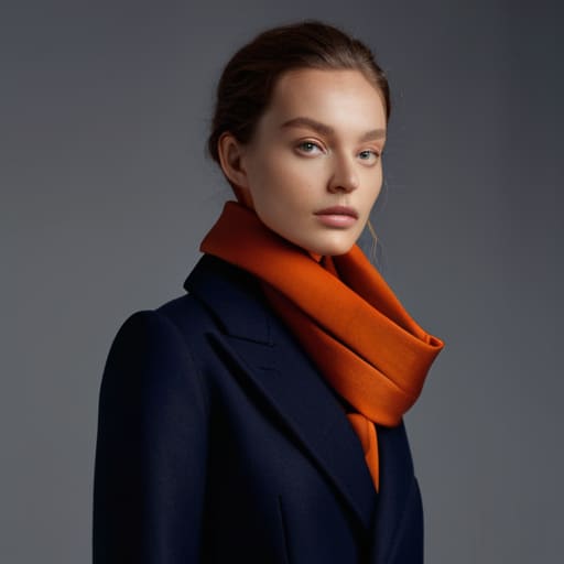
Look, you don’t need to sit in a lecture hall to understand colour wheel fundamentals; you just need to stop treating your wardrobe like a collection of random, clashing accidents. Most people think they’re “bad at colour,” but usually, they’re just ignoring how light and pigment interact. If you want to stop looking like a chaotic highlighter, start with the basics of complementary colour schemes. This isn’t about matching your shoes to your bag—it’s about finding those opposites on the wheel, like a deep navy paired with a burnt orange, to create tension that actually looks intentional rather than accidental.
Forget the complex math of colour theory for designers for a second and just look at your skin. Everything boils down to the balance between warm and cool tones. If you’re wearing a mustard yellow that makes you look like you’ve been under fluorescent lights for a week, it’s not a “you” problem, it’s a temperature problem. Once you figure out whether your undertones lean gold or pink, you can stop gambling with every new shirt you see and start buying pieces that actually make you look awake.
Why Warm and Cool Tones Dictate Your Wardrobes Structural Cohesion

Look, you can spend three hours staring at a pile of clothes, but if you’re trying to pair a mustard yellow sweater with a lilac skirt when your skin undertones are fighting that battle, you’re just creating visual noise. This isn’t about “vibes”; it’s about how light interacts with your face. When we talk about warm and cool tones, we are talking about the foundation of whether a garment looks like it belongs to you or like you’re just wearing a costume. If you have cool undertones and you force yourself into heavy, orange-based earth tones, you aren’t going to look “boho”—you’re just going to look tired.
Understanding these basics is how you achieve actual colour harmony principles without needing to buy a whole new capsule collection. Once you identify your temperature, you stop fighting your clothes. You can use complementary colour schemes to create impact, but only if the base temperature is consistent. It’s the difference between a wardrobe that feels intentional and one that feels like a collection of random mistakes.
Using Colour Harmony Principles to Make Cheap Basics Look Expensive
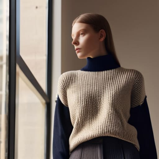
The biggest lie in fashion is that “expensive” is a price tag. In reality, expensive is just a visual signal of intention. When you throw on a random navy jumper and some grey trousers, you look like you’re just trying to get through the day. But when you apply basic colour harmony principles, suddenly that £15 high-street knit looks like it was curated. The trick is to stop treating your clothes like individual items and start seeing them as a structural system.
If you want to trick the eye into seeing luxury, lean into monochromatic layering or tight analogous schemes. Using different shades of the same family—say, a forest green trouser with a sage knit—creates a continuous line that looks incredibly polished. Alternatively, if you’re working with budget basics, use complementary colour schemes in your accessories. A cheap black outfit can look intentional and high-end if you hit it with a single, sharp pop of a contrasting tone, like a burnt orange scarf. It’s not about the fabric weight (though that matters too); it’s about showing that you actually know why those two colours are sitting next to each other.
The Math of Complementary Colour Schemes and Colour Psychology
Look, I’m not going to lecture you on the abstract “vibes” of a sunset, but there is actual logic to why certain pairings feel like a punch in the face while others feel like a sigh of relief. When we talk about complementary colour schemes, we are talking about high-contrast math. If you take a navy blazer and pair it with a burnt orange knit, you aren’t just “matching”; you are using opposite sides of the wheel to create visual tension. It’s a way to make a basic outfit look intentional rather than accidental.
But tension can be exhausting if you don’t balance it. This is where the psychology of colour hits your actual life. If you’re heading into a high-stakes meeting, a heavy dose of structured navy or charcoal provides a psychological anchor of stability. If you pair that with a jarring, high-saturation yellow, you might look like a highlighter. The goal is to use these principles to direct the eye, not to overwhelm it. Use the math to decide where the “pop” goes—maybe a scarf or a belt—so the rest of your silhouette stays grounded and expensive-looking.
Five ways to stop treating colour like a hobby and start using it like a tool
- Stop buying “statement” pieces just because the pigment is loud; if that neon green doesn’t play nice with the three pairs of trousers you actually wear on a Tuesday, it’s just expensive clutter that will sit in your drawer until you feel guilty enough to donate it.
- Use the “sandwich method” to create instant cohesion—match the colour of your top to your shoes and keep the middle (your trousers or skirt) a neutral or a contrasting tone. It’s a low-effort way to make a mismatched outfit look like you actually planned it.
- Check the fabric’s reaction to light before you commit; a cheap polyester in a bright primary colour often looks “plastic” because the synthetic fibres reflect light harshly, whereas a natural wool or heavy cotton in the same shade will absorb it and look significantly more expensive.
- Learn to distinguish between a “pop of colour” and a “clash of value.” If you’re wearing a pale pastel blue with a deep navy, you aren’t clashing, you’re playing with depth. Real clashing happens when two colours have the same intensity but different hues, which just makes your brain itch.
- Don’t let a single “perfect” colour ruin your wardrobe’s math. If you find a gorgeous emerald silk blouse that looks divine on you but matches absolutely nothing you own, don’t buy it. Unless you’re prepared to spend £15 at a tailor to reshape it or another £40 on matching bottoms, that blouse is a bad investment.
Stop dressing for the mannequin
Stop treating color like a personality trait you can just buy off a rack; if you aren’t matching your palette to the actual weight of your fabrics and the way your skin reacts to light, you’re just wearing a costume that’s going to make your entire wardrobe feel disconnected by next Tuesday.
Neve Okonkwo-Barr
Stop overthinking it and just start wearing it
Look, we’ve covered a lot of ground, from the structural logic of warm and cool tones to the actual math behind complementary schemes that make a ten-pound thrifted shirt look like a designer piece. The takeaway isn’t that you need to memorize a color wheel like you’re sitting a GCSE; it’s that you need to stop treating color as an afterthought or a “vibe” and start seeing it as a tool for cohesion. When you understand how shades interact with your skin tone and your existing fabrics, you stop buying “one-off” pieces that sit idle in your wardrobe because they don’t play well with anyone else. Color is the glue that connects your clothes, and once you master that, you stop being a victim of trends and start being the architect of your own look.
At the end of the day, your wardrobe shouldn’t feel like a puzzle you’re constantly failing to solve. If you’ve got the right color principles in your back pocket, you can walk into any shop—or any charity bin—and know exactly what will work. Don’t let the marketing industry convince you that you need a massive budget to look polished; you just need a bit of logic and the confidence to wear what actually suits you. Style isn’t about having the most clothes, it’s about having the right ones that work together on a random Tuesday morning. Now, go open that closet, look at what you actually own, and start making it work.
Frequently Asked Questions
If I find a vintage piece in a perfect complementary colour but the fabric is a cheap, thin polyester, is it still worth trying to style?
If it’s thin, shiny polyester, run. I don’t care how perfect the colour is; cheap synthetics don’t drape, they cling, and they look “costume” the second you move. A great colour in a bad fabric just highlights the poor construction. Unless you can layer it under something heavy to hide the structural failure, save your money. A bargain isn’t a bargain if the fabric looks like a bin bag by Tuesday.
How much should I actually budget for a tailor to adjust a garment if the colour is right but the silhouette is pulling in the wrong places?
Look, if the color is perfect but the silhouette is fighting you, don’t panic—but don’t overspend either. A basic hem or taking in side seams usually runs you £15–£25. If you’re dealing with complex structural issues like adjusting shoulders or a full waist taper, budget closer to £40–£60. Always ask for the quote before they touch the fabric. If the alteration costs more than half the garment’s original price, it’s probably not a bargain.
Can I actually make a wardrobe work if I only stick to neutrals, or am I just setting myself up for a boring closet?
You aren’t setting yourself up for boredom; you’re setting yourself up for cohesion. A neutral wardrobe isn’t a lack of style, it’s a foundation of reliability. The trick is playing with texture and weight so you don’t look like a beige smudge. A heavy wool charcoal trouser paired with a crisp cotton poplin shirt looks intentional; two flat, cheap polyester blends in the same shade look like a mistake. Focus on the fabric, not the pigment.
