I spent three years in a basement studio pinning hems for people who thought a “fashionable” print could hide a terrible fit, and if there is one thing I’ve learned, it’s that the industry loves to gaslight you. They want you to believe that understanding how pattern mixing works requires a degree in color theory or a wardrobe full of expensive, seasonal “statement pieces.” It’s a lie designed to make you feel like you can’t pull off a striped shirt unless it costs more than your weekly grocery budget. In reality, pattern mixing isn’t some high-level math equation you can’t solve; it’s just about balancing visual weight so you don’t end up looking like a pile of laundry that exploded in the dryer.
I’m not here to give you a lecture on “aesthetic cohesion” or tell you to go buy a whole new capsule collection. I’m going to show you how to use what you already have by looking at scale, line, and fabric weight. I’ll explain why that vintage polka-dot blouse actually works with your plaid trousers, and I’ll tell you exactly which cheap prints look expensive and which ones will fall apart after two washes. This is about making your clothes work for a Wednesday, not a runway.
Stop Buying New Outfits How Pattern Mixing Works for Real Life
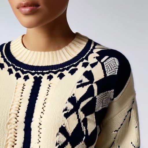
Look, the easiest way to avoid looking like a chaotic pile of laundry is to stop treating pattern mixing like a math equation you can’t solve. Most people think they need a brand-new wardrobe of “matching” sets to pull this off, but that’s just more consumerist nonsense. Real style happens when you understand the visual weight of patterns. If you’re wearing a heavy, chunky Fair Isle knit, don’t try to pair it with a tiny, delicate micro-dot silk blouse; the scale of the print needs to breathe. You want to balance a large, loud print with something much smaller or more subtle so they aren’t fighting for dominance in the mirror.
The secret isn’t buying more; it’s learning how to play with styling different pattern scales within what you already own. If you have a bold, oversized floral skirt, pair it with a thin, micro-striped top. They share a common language because one is dominant and the other is supporting. It’s about finding that sweet spot where the eye can move across the outfit without getting stuck on a single loud detail.
The Math of Scale Styling Different Pattern Scales Without Chaos
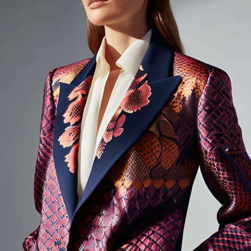
If you’ve ever looked in the mirror and felt like you were wearing a visual migraine, it’s probably because you ignored the scale. Think of it this way: if you pair a tiny, tight polka dot with a similarly tiny, tight stripe, they aren’t “matching”—they are fighting for the same inch of space in your eyeballs. To make mixing prints in fashion actually work, you need to create breathing room. You want one pattern to be the loud, confident leader and the other to be the quiet supporting actor. I’m talking about pairing a massive, sweeping floral print with a micro-check or a thin pinstripe. This creates a hierarchy so your eyes know exactly where to rest.
It’s all about managing the visual weight of patterns. A heavy, dark geometric print carries a lot of “gravity,” so you shouldn’t pair it with another heavy hitter unless you’re trying to look like a piece of modern art. Instead, balance that weight with something lighter, like a fine-lined sketch or a soft, washed-out print. If the scale is right, the patterns sit side-by-side like friends at a table rather than two people shouting over each other at a pub.
Geometric vs Floral Patterns Finding Your Visual Weight Balance
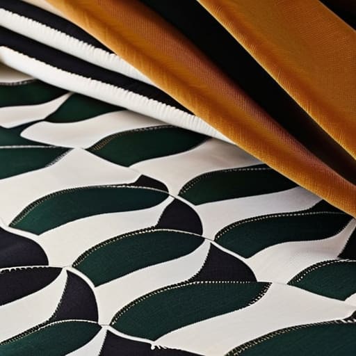
When you’re staring at a structured, geometric print—think stripes, windowpane checks, or those rigid grids—and a soft, swirling floral, your brain probably screams “clash.” That’s because you’re sensing the conflict between hard lines and organic shapes. The trick to geometric vs floral patterns isn’t about making them match; it’s about managing the tension. A heavy, dark-toned checkerboard has a massive amount of visual weight, so if you pair it with a tiny, ditsy floral, the flower will get swallowed whole. You want the floral to have enough “heft”—either through a larger scale or a bolder color—so it can actually stand its ground against those straight lines.
If you’re worried about looking like a chaotic garden, lean into complementary color palettes to act as the glue. If both prints share even one common thread—say, a specific shade of forest green or a muted cream—the eye accepts them as a deliberate choice rather than a laundry accident. I always tell my clients: if the shapes are fighting, let the colors negotiate. Use a structured blazer to frame a soft print, and suddenly, you aren’t wearing a costume; you’re just wearing clothes that actually make sense.
The Logic of Color Using Complementary Color Palettes to Win
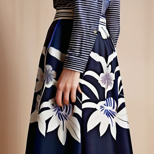
Look, you don’t need a color wheel degree to get this right, but you do need to stop treating every print like it’s an isolated island. When you’re mixing prints in fashion, the easiest way to stop the visual noise is to find a common thread. If your striped shirt has a tiny hint of navy, pair it with a floral skirt that also has navy in the petals. It doesn’t matter if the patterns are totally different; that shared color acts like an anchor, telling the eye that this is a deliberate choice, not a laundry accident.
If you want to go bolder, lean into complementary color palettes. This is where you pair opposites—think a forest green plaid with a muted terracotta. Because these colors are naturally balanced, they can handle the heavy lifting of different pattern scales without making you look like a walking kaleidoscope. Just remember: if the colors are high-contrast, keep the visual weight of patterns in check. One print should be the loud person at the party, and the other should be the one nodding along in the corner.
Beyond the Print Coordinating Textures and Prints for Longevity
Here is the truth about why some outfits look “expensive” and others just look messy: it’s rarely just about the colors. You can have the most perfect complementary color palettes in the world, but if you pair a flimsy, fast-fashion polyester floral print with a heavy, structured wool check, the whole look collapses. The cheap fabric will visually “sink” under the weight of the heavier piece, making the outfit look unbalanced and, frankly, a bit sad. When I’m looking at a garment, I’m checking the fiber content as much as the print; a high-quality natural fiber like linen or heavy cotton holds a pattern’s integrity much better over time than something that feels like a plastic bag.
To master coordinating textures and prints, you need to think about the physical depth of the clothing. If you are playing with geometric vs floral patterns, try pairing a smooth, crisp poplin shirt with a chunky, textured knit sweater that has a subtle jacquard weave. The contrast in tactile weight creates a sophisticated layer that keeps the eye moving. It’s about creating a sense of stability. If everything is thin and shiny, you look like a mannequin; if everything is heavy and matte, you look swallowed. Aim for one “anchor” texture to ground the visual noise.
The Reality Check: 5 Rules for Mixing Prints Without Looking Like a Costume
- Find your anchor color. If you’re mixing a stripe and a floral, make sure they both share at least one common thread—literally. If the navy in your striped shirt matches the navy in your patterned skirt, the brain sees “intentional outfit” instead of “I got dressed in the dark.”
- Respect the scale of your body and the garment. If you’re wearing a heavy, oversized wool coat with a massive, sprawling print, don’t try to pair it with tiny, microscopic polka dots. The visual weight will clash so hard it’ll look like the clothes are fighting each other. Go big to go big, or small to stay subtle.
- Use a “neutralizer” to stop the madness. If you’ve gone heavy on the patterns, you need a break for your eyes. A solid black belt, a plain denim jacket, or a simple cotton tee acts as the visual silence that makes the patterns actually readable rather than just a blur of noise.
- Check the fabric’s integrity before you commit. A beautiful print on a cheap, thin polyester will look frantic and “costumy” because the fabric doesn’t have the weight to hold the design. A print on a heavy cotton or a structured linen holds its shape, which makes the pattern look expensive even if it wasn’t.
- Don’t fear the “ugly” print if the fit is perfect. I’ve seen people avoid a bold geometric print because they thought it was “too much,” but if the shoulder seams sit exactly where they should and the waist isn’t pulling, that print becomes a statement of confidence rather than a distraction. Fit is the foundation; the pattern is just the decoration.
The Truth About Pattern Mixing
Stop treating pattern mixing like a math equation you can’t solve; it’s actually just about balancing visual weight so you don’t look like a pile of laundry. You don’t need a brand-new capsule wardrobe to make this work—you just need to understand that a heavy, dark stripe can anchor a floaty, tiny floral print, provided you aren’t fighting the fabric’s natural drape.
Neve Okonkwo-Barr
Stop Overthinking It and Start Wearing It
Look, we’ve covered the mechanics: you balance the visual weight by playing with scale, you anchor the chaos with a shared color palette, and you use texture to make sure the whole thing doesn’t feel like a flat, printed mess. Pattern mixing isn’t some high-concept art installation that requires a degree to understand; it’s just about managing how much your eye is being pulled in different directions at once. If you can master the difference between a large-scale floral and a tight geometric print, you’ve already won half the battle. Remember, the goal isn’t to look like a walking mood board—it’s to make sure your clothes look like they belong together, even when they’re shouting.
At the end of the day, most of the “rules” you see in glossy magazines are just there to sell you a brand-new wardrobe that doesn’t actually exist in your closet. You don’t need a fresh haul of coordinated sets to look intentional; you just need to look at what you already own through a different lens. If a striped shirt feels “too much” with your checked skirt, don’t run to the shops. Adjust the proportions, check the fabric weight, or maybe just stop treating your wardrobe like a math equation you can’t solve. Style is about how you move in the clothes, not how perfectly you follow a textbook. Now, go put something weird together and see how it feels.
Frequently Asked Questions
What happens if I find a pattern I love but the fabric feels cheap and thin—can a tailor actually save the silhouette or is it a lost cause?
If the fabric is paper-thin and lacks “memory”—meaning it won’t hold a shape once you move—a tailor can’t perform miracles. I can take in the waist or shorten the hem, but I can’t add structural integrity to a flimsy weave. If it feels like a glorified napkin, it’ll drape like one. Unless you’re adding a structured lining or interfacing, save your money. A perfect fit on a cheap, shapeless fabric still looks cheap.
I have a vintage patterned piece with a weirdly heavy shoulder seam; how do I mix that with modern prints without looking like I'm wearing a costume?
That heavy shoulder seam is a structural signal—it’s high visual weight. To avoid looking like you’re in a period drama, don’t fight the vintage vibe with more “costume” pieces. Instead, pair it with something aggressively modern and structurally simple. Think a crisp, high-quality cotton poplin or a smooth technical fabric in a contemporary print. If the vintage piece is loud, keep the modern print small-scale. You’re balancing old architecture with new geometry.
Is it actually worth paying for professional alterations to match the drape of two different patterned fabrics, or will they always look disconnected?
If you’re trying to join two different patterned fabrics—say, adding a patterned yoke to a printed bodice—the “disconnect” usually isn’t the print; it’s the weight. If one is a flimsy viscose and the other is a heavy cotton, they’ll fight each other and pull at the seams. Paying a tailor to stabilize the seam allowance or add interfacing isn’t just worth it; it’s the only way to make them behave like one garment.
