I spent three years pinning hems for a bridal shop, and if there is one thing I learned, it’s that a woman can be wearing her “perfect” seasonal palette and still look like she’s wearing a costume. I’ve watched people spend hundreds on professional consultations only to walk away feeling more restricted, like they’ve been handed a rulebook instead of a wardrobe. We need to talk about how colour analysis works and where it fails, because the industry loves to sell you the idea that your identity is tied to a swatch of silk. The truth is, a “correct” shade won’t save a cheap, thin polyester blend that loses its shape by Tuesday, and it certainly won’t fix a neckline that sits all wrong.
I’m not here to tell you that you’re a “True Autumn” or a “Cool Summer” so you can go out and buy more stuff you don’t need. Instead, I’m going to show you how to actually use these tools without letting them dictate your bank account or your personality. I’ll break down the science of undertones, explain why certain pigments wash you out regardless of your “season,” and tell you when to stop worrying about the palette and start focusing on the fabric and fit.
The Seasonal Colour Theory Explained Beyond the Pretty Little Palettes
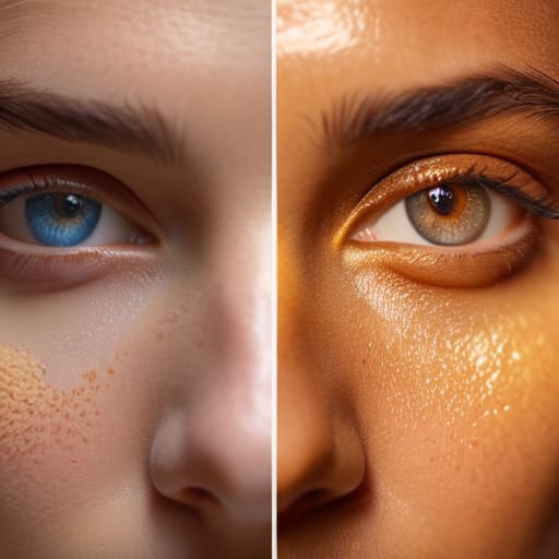
Here is the breakdown of how the system actually functions. At its core, seasonal colour theory explained is just a way of categorizing how much “warmth” or “coolness” your skin holds. The idea is that your skin, eyes, and hair share a common temperature, and by matching your clothes to that temperature, you achieve a certain chromatic harmony in fashion that makes you look awake rather than washed out. It relies heavily on distinguishing between your undertone vs overtone—the difference between the surface redness of a breakout and the actual golden or pinkish hue living beneath your skin.
In a professional setting, this is usually done through a draping technique effectiveness test, where a consultant throws different colored cloths under your chin to see which one makes your shadows disappear. If you’re a “True Winter,” you’re looking for high contrast and icy tones; if you’re an “Autumn,” you’re leaning into the earthy, muted stuff. It’s a helpful framework for narrowing down a shopping list, but it’s a rigid one. It treats humans like static paint swatches rather than living, breathing people who might want to wear a color just because it makes them feel powerful, regardless of what their “season” says.
Undertone vs Overtone Why Your Skin Isnt a Flat Surface

Here is where most people get tripped up by the internet’s version of color analysis. They look at a photo, see they have “cool” skin, and suddenly think they can only wear icy blues. But your skin isn’t a flat piece of construction paper; it’s a living, breathing landscape of different layers. This is the core of the undertone vs overtone debate. Your overtone is what you see in the mirror—the redness from a sunburn, the sallowness of a long week, or the tan you picked up in July. That changes constantly. Your undertone, however, is the permanent temperature underneath it all.
The reason so many “personal colour palette guides” fail is that they ignore how these layers interact. If you only focus on your surface redness, you’ll end up buying clothes that clash with your actual DNA. This is why professional draping technique effectiveness matters so much more than a filtered TikTok video. A good stylist isn’t just looking at whether you look “good” in pink; they are looking at how the fabric’s pigment reacts to the light hitting your specific skin chemistry. If you ignore the depth of your undertone, you’re just chasing a temporary glow that will vanish the moment the seasons shift.
How Colour Analysis Works and Where It Fails Your Wardrobe

At its core, the process relies on the draping technique effectiveness—literally holding pieces of fabric against your face to see if your skin looks vibrant or like you’ve just survived a bout of the flu. The idea is to find a level of chromatic harmony in fashion that aligns with your natural features so that the clothes support you rather than wearing you. When it works, it’s a shortcut to feeling cohesive. When it fails, it’s because the system assumes you are a static, two-dimensional object.
The reality is that colour analysis accuracy limitations are everywhere. Most tests ignore how much a person’s skin changes with sun exposure, hormonal shifts, or even just the lighting in a poorly lit dressing room. You might be told you’re a “Cool Winter,” but if you buy a wardrobe of strictly icy blues and silvers, you’ll find yourself looking washed out the moment you step into natural sunlight. A personal colour palette guide is a lovely compass, but it isn’t a law. If a color makes you feel powerful but technically sits “outside your season,” wear the damn shirt.
The Draping Technique Effectiveness Science or Just Expensive Lighting

If you’ve ever seen those TikTok videos where someone holds up a piece of bright orange fabric and suddenly looks like they’ve been hit by a lighting rig, you’ve seen the “magic” of draping. In theory, the draping technique effectiveness relies on seeing how different hues reflect light onto your skin to reveal whether you lean warm or cool. It’s a tactile way to test chromatic harmony in fashion without committing to a whole new wardrobe. When it works, it’s a revelation; when it doesn’t, you’re just a person standing in a room with some expensive scraps of silk.
The problem is that draping is incredibly sensitive to the environment. If your consultant is working under warm-toned LEDs or near a window with afternoon sun, the results are basically junk. You can’t judge an undertone vs overtone if the light source itself is lying to you. This is one of the biggest colour analysis accuracy limitations I see: people walk away with a “seasonal” label that only works in a specific studio, but fails them the second they step into the grey, flat light of a Tuesday morning commute.
Achieving Chromatic Harmony Without Buying a Whole New Closet
Here is the reality: if you follow a personal colour palette guide to the letter, you’ll end up with a wardrobe that looks like a curated museum exhibit but feels like a costume. You don’t need to bin your entire navy blazer or that forest green sweater just because a consultant told you you’re a “True Summer.” Instead, focus on chromatic harmony in fashion through the lens of what you already own. If a garment is slightly off-tone, look at how it interacts with your face versus how it interacts with your other clothes. Often, a “wrong” colour becomes a neutral if it’s paired with the right weight of fabric or a texture that softens the impact.
The goal isn’t perfection; it’s intentionality. If you have a piece you love that clashes with your seasonal theory, don’t throw it out—use it as a deliberate accent. I’ve seen people pull off “incorrect” shades simply by changing the neckline or adding a scarf that sits closer to the skin to bridge the gap. Remember, style is about how you wear the clothes, not how well you obey a color wheel. Focus on the balance of the whole outfit rather than the strict accuracy of a single item.
Five Ways to Stop Letting Colour Theory Dictate Your Life
- Prioritise fabric over hue. A navy linen shirt in a ‘cool’ palette will look significantly more expensive and hold its shape better than a ‘perfectly matched’ polyester blend in your seasonal shade. If the weave is cheap, the colour won’t save it.
- Use the ‘Face-Adjacent’ rule for expensive pieces. If you’re eyeing a gorgeous emerald dress that is technically outside your palette, buy it—but ensure your jewellery or a scarf near your jawline stays within your zone. It’s about managing the visual impact, not being a prisoner to a swatch.
- Factor in the alteration cost of “palette-perfect” finds. I often see people buy a piece just because the colour is right, only to find the fit is a disaster. If you have to spend £25 on a waist nip just to wear a “correct” shade, you haven’t saved money; you’ve just bought a more expensive mistake.
- Account for lighting, not just skin. A palette might look great in a bright studio but turn muddy under office fluorescents or dim restaurant lights. Before committing, check how the fabric reacts to different light sources; if the colour shifts from vibrant to grey, it’s a bad investment.
- Don’t let a “seasonal” label kill your joy. If you are a “Summer” but you feel like a powerhouse in a burnt orange blazer, wear the blazer. The goal is a wardrobe that works on a Wednesday, not a wardrobe that makes you look like a textbook illustration.
The Math of Color vs. The Reality of Fabric
Color analysis is a useful tool for finding your baseline, but don’t let a seasonal palette trick you into buying a ‘perfect’ pastel silk blouse that has zero structural integrity; a shade might match your undertones, but if the fabric is paper-thin and the fit is rubbish, you’re just wearing a very expensive mistake in the right hue.
Neve Okonkwo-Barr
Stop Dressing for a Palette, Start Dressing for Yourself
At the end of the day, colour analysis is just one tool in a very large, very messy toolbox. It can help you understand why that neon mint sweater makes you look like you’ve had three nights of zero sleep, but it won’t tell you if the fabric weight is too flimsy or if the shoulder seam is sitting two inches too low. Don’t let a “Seasonal Palette” dictate your entire identity or, worse, convince you to bin perfectly good clothes just because they aren’t technically in your “zone.” If a garment fits your body beautifully, has a decent seam allowance, and the fabric can actually survive a washing machine, it belongs in your wardrobe regardless of what a swatch book says.
My advice? Use the theory to guide your next thrift store find, but never let it become a rulebook that keeps you from wearing things you actually love. Style isn’t about achieving some mathematical perfection in chromatic harmony; it’s about the confidence that comes from wearing clothes that feel like you. If you find a vintage blazer that makes you feel like a powerhouse, wear it. If you love a color that technically “clashes” with your undertone, wear it. The best version of your style isn’t found in a color wheel—it’s found in the clothes that make you stop checking the mirror and start living your life.
Frequently Asked Questions
If I find a gorgeous vintage wool coat that’s totally outside my "seasonal palette," can I still wear it if I style it correctly with my actual colors?
Absolutely. Please, for the love of all things sartorial, do not let a seasonal palette stop you from buying a high-quality wool coat. If the fabric is heavy, the construction is solid, and it fits your shoulders perfectly, it’s a win. Just balance it out: wear your “correct” colors near your face with a scarf or a turtleneck. I’d much rather see you in a “wrong” color that lasts a decade than a “right” one that’s thin, shapeless, and destined for the bin.
How much of my "wrong" color is actually just a bad fabric choice—like a cheap synthetic that makes a color look muddy versus a high-quality natural fiber?
Honestly? A huge part of it. A cheap, high-shine polyester can make a vibrant jewel tone look like murky pond water because the light hits the plastic fibers weirdly. Natural fibers like wool or heavy linen absorb light instead of bouncing it back aggressively. If a color feels “off,” check the composition tag. A $10 synthetic teal will always look muddier than a $40 cotton one, regardless of your seasonal palette.
Is it worth paying for a professional color analysis if I’m planning to spend most of my budget on getting my existing clothes tailored to fit better?
If you’re choosing between a color consultant and a tailor, pick the tailor every single time. A “perfect” shade of emerald means nothing if the shoulder seam is drooping two inches too low. Color analysis is a luxury; fit is a necessity. Spend that money on getting your current wardrobe sculpted to your actual body. A well-fitted navy blazer in the “wrong” season looks intentional. A poorly fitted silk blouse in your “perfect” palette just looks messy.
