Stop listening to the “experts” who tell you that a photoshoot requires a brand-new, high-end wardrobe or a professional stylist on retainer. It’s a total scam. I spent two years pinning hems in a cramped bridal studio, and I can tell you that most people show up to their sessions wearing expensive fabrics that look terrible on camera because they haven’t accounted for how light hits a specific weave or how a poorly placed seam pulls under a flash. If you’re looking for a complete guide to dressing for photographs that involves blowing your rent money on “statement pieces” that you’ll never wear again, you’ve come to the wrong place.
Instead, I’m going to show you how to actually use what you already own—or what you can find for twenty quid in a charity shop—to look intentional. We aren’t talking about trends; we are talking about fabric weight, structural integrity, and the magic of a twenty-pound tailor visit. I’ll walk you through which textures survive a high-res lens and how to avoid the dreaded “costume” look. This is about making sure you look like yourself, just sharper, without the unnecessary markup.
Stop Buying Looks a Complete Guide to Dressing for Photographs
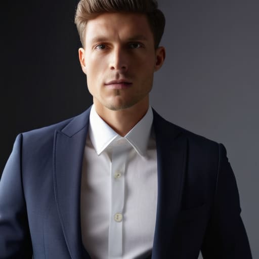
The biggest mistake I see people make before a shoot is thinking they need a “new look.” You don’t. You need clothes that don’t fight with the lens. When people ask me what to wear for professional headshots, my answer is always the same: wear the thing you already own that makes you feel like a human being, not a mannequin. The camera is a liar; it amplifies every single flaw in construction. If your shirt has a collar that won’t stay upright or a shoulder seam that’s drooping halfway down your arm, no amount of professional lighting is going to save you.
Instead of hunting for a “statement piece,” focus on fabric choices for camera lenses. Avoid anything too shiny or synthetic—polyester blends tend to bounce light in ways that make you look sweaty or washed out under studio strobes. I’m also a huge advocate for avoiding busy patterns in portraits. A tiny, tight print might look fine in a mirror, but on a high-resolution sensor, it turns into a vibrating, dizzying mess called moiré. Stick to solid colors with some weight to them; it’s much easier for a tailor to nip in a heavy cotton or wool than a flimsy, patterned rayon.
The Physics of Light Smart Clothing Colors for Studio Lighting
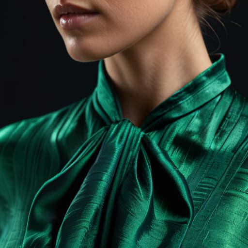
Here is the reality: a studio light doesn’t care if your outfit is “on trend”; it only cares about how much light your clothes bounce back or soak up. If you show up in a stark, bright white shirt, you’re going to look like a floating head because the light will blow out the fabric and erase your jawline. On the flip side, heavy blacks can turn into a shapeless void where all your detail vanishes. When people ask me what to wear for professional headshots, I tell them to look for mid-tones. Think jewel tones, soft olives, or dusty blues—colors that have enough depth to look rich but enough light to show the actual shape of your body.
You also need to think about texture versus pattern. I’m constantly avoiding busy patterns in portraits because a tiny, high-contrast print will create a “moiré effect”—that weird, vibrating digital glitch that makes the camera lens go haywire. It’s a nightmare to fix in post-production. If you want visual interest, skip the print and go for a fabric with a subtle grain, like a heavy linen or a fine-gauge knit. It gives the light something to catch without distracting from your face.
Why Your Patterns Fail Avoiding Busy Patterns in Portraits
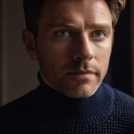
Here is the hard truth: a camera lens is a literal thief. It doesn’t just capture your face; it steals the visual energy from everything else in the frame. When you show up in a tiny, high-contrast polka dot or a frantic floral print, the lens gets distracted. Instead of seeing your eyes, the viewer is stuck in a visual loop trying to process the geometry of your shirt. This is the biggest mistake I see when people ask me what to wear for professional headshots; they think a “statement print” shows personality, but in reality, it just creates visual noise that makes your skin look muddy and your features recede.
If you want the focus to stay on you, you need to respect the physics of the shot. Small, repetitive patterns often trigger a phenomenon called the Moiré effect, where the camera sensor and the fabric create these weird, dizzying wavy lines that look like a glitch in the matrix. If you aren’t ready to go solid, at least stick to larger, softer scales and matte textures. Avoiding busy patterns in portraits isn’t about being boring; it’s about making sure the camera actually sees you instead of your outfit.
Lens Ready Textures Fabric Choices for Camera Lenses and Depth
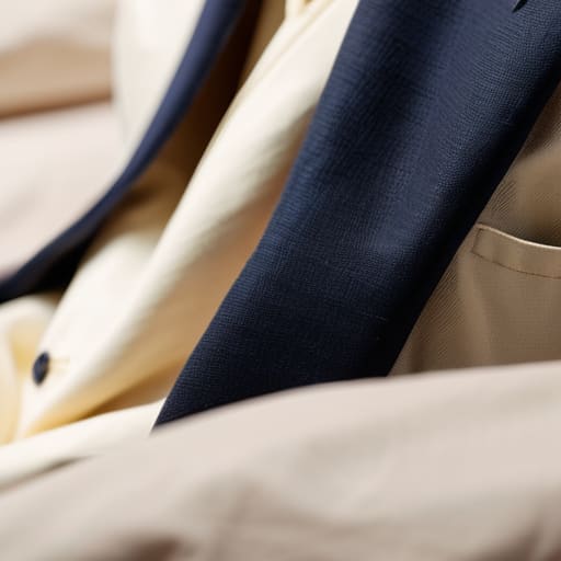
Most people focus so much on color that they completely forget about how a lens actually “sees” a surface. A flat, cheap polyester blend might look okay in your bedroom mirror, but under studio lights, it often looks like a shiny, plastic sheet. This is one of those moments where fabric choices for camera lenses actually matter more than the brand name on the tag. You want textures that catch the light without reflecting it like a disco ball. Think about the difference between a smooth, lifeless synthetic and a heavy-weight cotton twill or a matte wool. The latter has a “tooth” to it—a physical depth that gives the photo dimension and makes you look like a three-dimensional human rather than a flat cutout.
If you’re looking for styling tips for family portraits, my rule is to mix textures rather than matching colors. If everyone wears the exact same shade of navy, you’ll look like a corporate choir. Instead, pair someone in a chunky knit sweater with someone in a crisp denim or a structured linen. The contrast in how those fabrics hold light creates a visual richness that looks expensive, even if you found the pieces in a charity shop.
The Math of Matching Complementary Color Palettes for Photos
Look, you don’t need a color wheel degree to get this right, but you do need to stop thinking about what you like and start thinking about how colors react to each other on a sensor. When people ask me what to wear for professional headshots, they usually want to wear their favorite bright red sweater. The problem? Red is a bully. It bleeds into the skin tones around your jawline and makes you look like you’re running a fever. Instead, think about complementary color palettes for photos that create balance rather than competition. If you’re shooting against a warm, wood-toned background, a muted navy or a deep forest green provides a sophisticated contrast that lets your face do the talking.
If you are working on styling tips for family portraits, the goal isn’t to have everyone in matching white t-shirts—that’s a 2005 Pinterest cliché and it looks terrible in high-res. It’s about coordination through tonal shifts. Pick a base palette, like earth tones, and have everyone play in different shades of that same family. One person in oatmeal, one in terracotta, one in olive. It creates a visual rhythm that feels intentional without looking like a uniform.
Five Ways to Not Look Like a Mess When the Shutter Clicks
- Check your shoulder seams before you leave. If the seam is drooping halfway down your arm, the camera will pick up that “hand-me-down” silhouette instantly, making you look slumped even if you’re standing tall. If you can’t afford a new blazer, spend £15 at a local tailor to have the shoulders taken in; it’s the difference between looking professional and looking like you’re wearing your dad’s clothes.
- Do a “sit test” in front of a mirror. A shirt might look crisp when you’re standing, but if it bunches up into a weird, fabric-heavy knot around your stomach the moment you sit down, you’ll look uncomfortable and bulky in every seated portrait. If the fabric is too thin, it’ll ride up; if it’s too stiff, it’ll buckle. Choose a mid-weight cotton or a wool blend that moves with you rather than fighting you.
- Watch out for the “invisible” wrinkles. Most people check for big creases, but the camera loves to find the tiny, micro-wrinkles around the inner elbow and the crotch of your trousers. Don’t just rely on a quick spray; if you’re wearing a linen blend, accept that it will wrinkle, or just stick to a heavier crepe or a structured twill that holds its shape through a three-hour shoot.
- Mind your undergarments, especially with light-colored fabrics. A “cheap” white shirt often becomes transparent under studio strobes, turning your bra into the focal point of the photo. Instead of buying an expensive “opaque” shirt, just ensure you’re wearing seamless, skin-tone underwear. It costs nothing and saves you from a very awkward post-production retouching bill.
- Stop obsessing over “matching” and start looking at weight. A common mistake is pairing a heavy, chunky knit sweater with very fine, lightweight silk trousers. On camera, the visual imbalance makes the outfit look accidental rather than intentional. Aim for a similar “visual weight” across your silhouette so the eye moves smoothly from your head to your feet without getting stuck on a weird texture clash.
The Camera Doesn't Care About the Label
A high-end designer label means nothing to a lens if the shoulder seam is drooping or the fabric is so thin it looks like a napkin under studio lights; stop trying to buy a ‘look’ and start looking at the construction, because a $20 thrifted blazer with a $30 tailored waist will always photograph better than a $500 piece that doesn’t actually fit your frame.
Neve Okonkwo-Barr
The Final Stitch
Look, if you’ve followed along this far, you know that looking good on camera isn’t about having a massive budget or a closet full of “statement pieces” that you can only wear once. It’s about understanding that a camera is just a machine that reacts to light, texture, and shape. We’ve covered the essentials: skip the dizzying patterns that make a lens struggle, choose fabrics with enough structural integrity to hold their own, and stick to a color palette that actually plays well together. Most importantly, remember that a $20 shirt with a perfectly tailored shoulder will always photograph better than a $400 designer piece that’s pooling around your waist. Fit is your greatest asset, and it’s usually much cheaper to fix a hem than it is to replace a whole wardrobe.
At the end of the day, the most expensive outfit in the world won’t save a photo if you’re uncomfortable or feeling like you’re wearing a costume. Don’t let the fear of “doing it wrong” stop you from wearing what makes you feel like yourself. The goal isn’t to look like a mannequin; it’s to look like the best, most composed version of you on a random Tuesday. Use these rules as a framework, not a cage. Grab that decent blazer, take it to your local tailor, and walk into your shoot knowing that you aren’t just wearing clothes—you’re wearing a plan.
Frequently Asked Questions
If I find a vintage blazer that looks incredible but the shoulders are a bit too wide, is it actually worth paying a tailor to fix it for a photoshoot, or will it just look weird on camera?
If the fabric is high-quality wool or a heavy crepe, do it. If it’s a cheap polyester blend, walk away—the structure won’t hold the new seam. Wide shoulders create a “droop” that looks messy under studio lights, making you look slumped rather than powerful. It’ll cost you about £30–£50 to slim the sleeves and shoulder, but a sharp silhouette beats a “bargain” that makes you look like you’re wearing your dad’s suit.
I’ve heard people say avoid black because it "washes you out" in studio lights—is that actually true, or can I just use a different fabric weight to make it work?
It’s a bit of a myth, but with a grain of truth. Black doesn’t “wash you out”—it just absorbs light. In a studio, a cheap, thin black cotton tee will look like a flat, lifeless void in your photos. If you want black, go for weight and texture. A heavy wool crepe or a structured silk will catch the light on the folds and give you dimension. Just don’t expect a flimsy jersey to do the work for you.
How much should I realistically budget for alterations if I'm trying to make a high-street find look like a custom-fit designer piece for these photos?
If you’re aiming for that “custom designer” look on a high-street budget, don’t skimp on the tailoring. For a basic hem or taking in a waist, budget about £15–£25. If you want to reshape shoulders or nip a blazer for that sharp, high-end silhouette, you’re looking at £40–£60. It’s the difference between looking like you’re wearing a costume and looking like the clothes actually belong to you. Spend the extra twenty; the camera will see the difference.
